Mississippi Baptists Brand Typography
Confident & Friendly
The typography of the Mississippi Baptists suggests a simple, relatable, and accessible presence. The MBCB brand contains three typefaces: Sofia Pro, Utopia Std, and Josefin Sans. Together, they convey modernity and hospitality.
Primary Typeface
Sofia Pro is a modern sans serif typeface that has wide and open letterforms with subtle width variances. It feels approachable and friendly as well as professional and confident. It is highly legible for both print and screens and offers a variety of weights that will aid in creating strong type hierarchy throughout brand materials. It can easily be used for headlines, sub-headlines, and paragraph content.
- Ultra Light
- Extra Light
- Light
- Regular
- Medium
- Semibold
- Bold
- Black


Secondary Typeface
Utopia Std is a serif typeface that can be used alongside the primary typeface. Its clean letterforms and refined-yet-practical approach make it a strong pair with Sofia Pro. This serif typeface combines a classic style with unique, modern characteristics such as angled serifs. Overall, it shares the friendliness of Sofia Pro but brings an additional patina of sophistication and heritage. Together, Sofia Pro and Utopia Std make a harmonious pair, creating a winsome, clear, and consistent tone for the Mississippi Baptists brand.
- Regular
- Semibold
- Bold
- Black


Accent Typeface
Similar to the primary typeface Sofia Pro, Josefin Sans is a modern sans serif typeface that is full of character, energy, and enthusiasm. This typeface contains pointy “As” and dynamic lowercase letters. Josefin Sans is used in the Mississippi Baptists logo and can also be used in subtle and simple ways such as on business cards, bumper stickers, pens, or one-line statements. Because of its playful forms, this typeface should not be used in large bodies of text.
- Thin
- Light
- Semibold
- Bold


Usage Examples
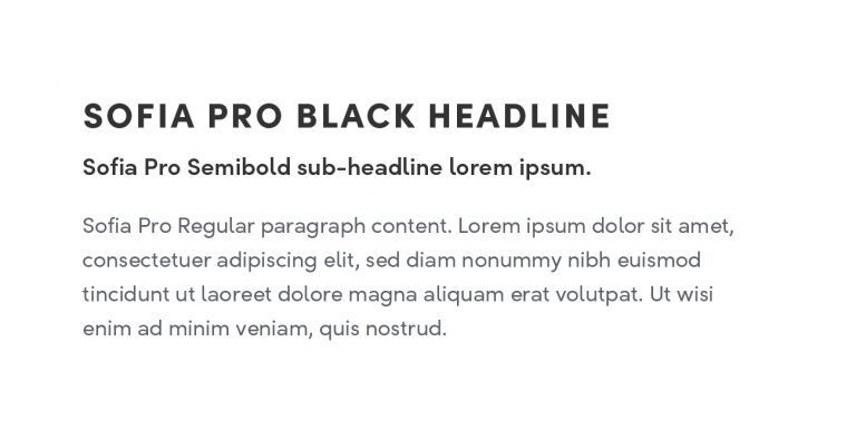
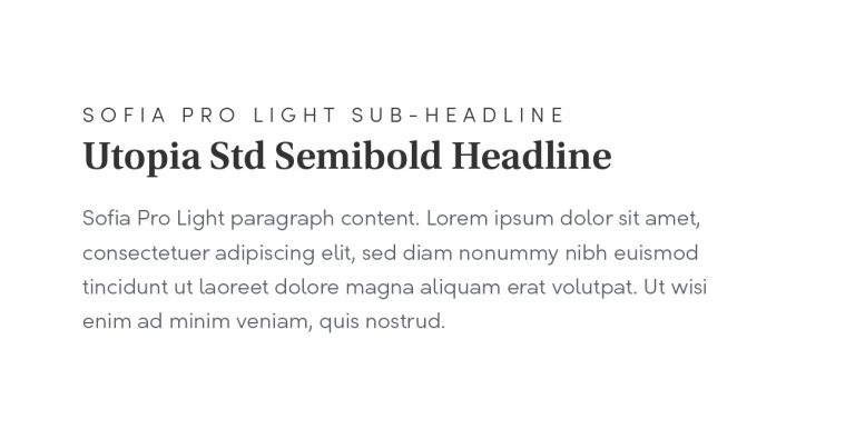
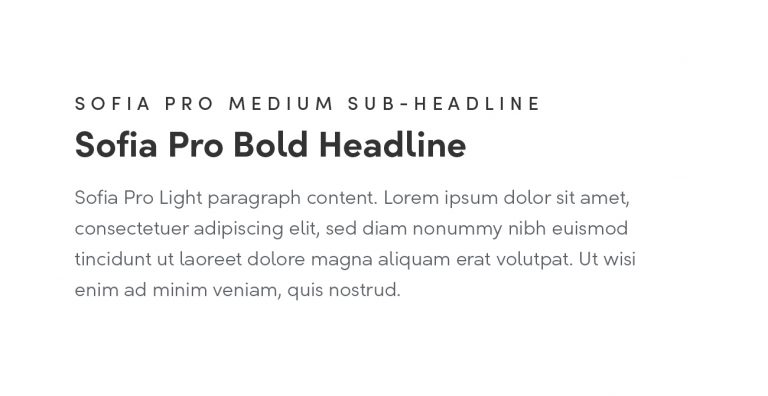
These are some examples of how the fonts can be paired together. There is versatility in how they can be used depending on the execution.

Solely using different weights of Sofia Pro creates a very cohesive look that feels impactful, modern, and friendly. An execution like this will work well on the web thanks to Sofia Pro's clarity and effectiveness at many different sizes.

Switching to Utopia Std for headlines emphasizes the thoughtfulness and tradition of the MBCB, while keeping Sofia Pro for a sub-headline and paragraph adds strength and confidence as well as approachability.

Another way to utilize different weights of Sofia Pro is to have a smaller sub-headline above a bold headline. Sofia Pro Light or Regular pairs nicely as body copy in this case.

